Technical information

|
Technical information |
|
|
Designing these pages I drew inspiration from some simple but to my notice important principles:
I also defined other two rules which are not real principles but objectives:
Whether I succeeded it is up to you to judge.
The design of these pages is based on the mentioned principles.
Pages are divided in two hierarchies belonging to the same root (see Dario de Judicibus). The two hierarchies represent the same content in the two languages: Italian and English. Each subtree of the hierarchy is represented by a subtable of content that shortly describes the content of its pages. At the very bottom are the leaves, that is, the real pages.
I usually prepare first the Italian pages, but when I already have some work in English. Anyway, I tried, whenever was possible, to ensure that pages be always lined up, at least as far as structure is concerned.
For each hierarchy I built a map which offers two advantages:
The state indicators have been realized using strings of characters rather than graphic images. In fact, the map of pages already uses a fairly elevated number of small icons to point out the position in the hierarchy of each single page. So I thought that it was better to avoid using other hundreds of images to represent also the state indicators.
What I did therefore was to define four possible states and to assign a color to each state, according to the following scheme:
BLACK |
Final version, not frequently updated |
GREEN |
Final version, periodically updated |
ORANGE |
Draft, under construction |
RED |
Empty, not yet implemented |
Furthermore I thought that it would be useful to show in each hierarchy the state indicators of both versions, the Italian and the English one. Such a design gives the possibility to whoever knows both languages to immediately jump to the page with the higher degree of completion. Naturally in each hierarchy I ordered the two indicators by positioning first that one that was relative to the language of the displayed trees. So, for instance, in the English hierarchy the indicators have been ordered as follows: [ENG][ITA].
|
|
|
Each page allows to quickly move to the initial page or homepage, to the root or to the complete map of its own hierarchy, to the page that is logically precedent in the hierarchy — not that one that was previously visited — and to the Italian page, if you come from the English one, or vice versa.
|
|
Furthermore I tried to avoid to add too much links between the various pages of a same hierarchy, to avoid to create too many alternative paths and to confuse the reader. The objective was to design an hypertextual scheme that is sufficiently complete but based on simple rules consistently used across the whole structure.
At last, I tried to avoid to use frames in pages, even because I did not want to develop two different versions of the same group of pages, one for browsers supporting <FRAMESET>, and one for those not managing multiple windows. There are exceptions, anyway. In fact, in such a large project it would be really a pity to forgo such an interesting technique. Furthermore, frames are quite common today in Internet. An example of frames in this site is the Italian section dedicated to Music.
Each page has an essential style. Background is always white. That is, I avoided to use too complicated backgrounds which might require different colors schemes for the text of each single page. The header always consists of an image that somehow represents the content of the page and a textual title. So the title could be read also from those who cannot see graphics. Same for the main links: they are represented by the image of a butterfly that flies, but you must click on the text, not on the image.
Generally, I did not add text inside the images, to avoid to have the necessity to prepare two different versions of those images, one for each language.
On the other hand, the page body depends on the content. However I avoided to force or assume that texts are rendered by a certain font. The only exceptions are few titles and the content of few tables. I use for those elements the Arial font or, as alternative, the Helvetica font, since both are very common.
The same type of fonts are also used when I quote texts extracted from other sources, as well as articles and stories written by me. In that case text is brown and indented with respect the basic text, like in the following example:
The fleet sails on August 10th, 1519 from St. Lucar, the harbor of Seville, for a trip that ends on September 6th, 1522 when the "Victoria," the only surviving ship, returns to the harbor of departure after completing the first circumnavigation of the globe in 2 years, 11 months and 3 days. Aboard the small ship (85 tons), embarking water and with emergency sails, there were 18 men of the 235 who left, including sailors and soldiers.
Source code was completely written by hand. I did not use any generator neither I exported documents from word processors or other products. Currently I am using an excellent shareware program to edit the code and see immediately the result of changes: HomeSite by Allaire Corporation. However most pages have been also developed by using a powerful text editor: Super NoteTab, developed by Eric G.V. Fookes.
That approach allowed me to reach two goals. First one is to have a more readable source code, also because of comments and simple editorial techniques (indentation, line and word spacing). The second one is to optimize the structure of code to speed up page loading, reducing in some case up to 200% the page size with respect what usually you may obtain by generating HTML code.
As far as graphic art is concerned, I used the following approach: all those images requiring a good definition but not requiring a high number of colors, all symbols, icons, charts, all the small images representing the various pages and in general all the small photos have been saved in GIF format; vice versa, all big photos and those images requiring a high number of colors have been saved in JPEG format.
I used several graphics products. To edit the images I used the CorelDRAW 7 suite, and Paint Shop Pro by Jasc Inc. I have a license of both products. A very good image viewer is ACDSee 32 by ACD Systems, Ltd.
However I tried to limit graphics, by using it only when it really provided some added value.
A particular attention was given to the references to other pages and sites. Generally, the average life of URLs in the Web is quite little. There are only few sites and the pages which maintain some degree of stability. Web changes continuously, and so its documents. Therefore it is quite difficult to frequently maintain up to date links to external pages and sites.
To avoid to fill my pages with hundreds of ephemeral and therefore of doubtful utility links, I decided to select only a limited number of sites in order to guarantee some stability. By the way, first, there are already hundreds of sites whose pages contain almost exclusively only links to other sites; second, when it is necessary to search something in net, it is more practical to use a search engine rather than to surf with no hints finding continuously broken links; third, I think it is useful to signal only those sites and pages that I personally analyzed and that, rightly or wrongly, I consider well done and interesting.
Most links are embedded in the body of pages, directly into the text where its hyperlink makes more sense. There are however pages that in my opinion are worth of some highlight. A bibliography of sort. The links to those pages are appended to the bottom of my pages and can be immediately recognized by the following graphic and text:
There are five categories of links:
Pages |
http: |
Selected links are usually very stable. However it may happen that also in the most stable sites pages may change. In that case I suggest to try to load the homepage of the referenced site. Once you are there, you may try to find out if the selected pages still exist. |
|
Newsgroup |
news: |
The possibility to see the selected newsgroups depends on the server to which you are connected. There are many public servers in the world that allow to see the most important international hierarchies. Unfortunately this is not always true for regional newsgroups. In that case it could be necessary to ask your ISP administrator to add the newsgroup to his/her news server. |
|
Binary newsgroup |
news: |
Many newsgroups containing binary resources, as images, sounds, and programs, are moderated. Others binary newsgroups have limitations or rules about which data could be attached to messages. Furthermore, uploading articles from those newsgroups might require a lot of time, since binary data might be also bigger than one megabyte. |
|
Mailing list |
mailto: |
To access some mailing lists it might be first necessary to enroll. When possible I enclose in parenthesis the address to which you should send your registration. Otherwise you may always try to send the application to the list itself, and wait for an answer from the responsible of the list. |
|
E-mail address |
mailto: |
The selected addresses refer to people or groups that can be contacted by those who might be interested to their services or information. Needless to say that an inopportune or incorrect usage of such addresses could force them to cancel or modify those addresses. |
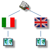
In the case of bilingual or multilingual references,
when possible, I pointed out for each reference the supported language or languages. The indication of the
language is provided by a small flag with alternative text in case you cannot see graphics.
At the same time, moderated newsgroups are flagged by the symbol![]() .
.
|
|